Motion Design · Styleframes · 2022
Nike: Tiempo Legend VII
Designing a :05s in-store promo that translates brand emotion into five seconds of precision and impact.
role
Lead Designer
tools
awards

Nike came to us with a brief to develop a dynamic design solution for a :05s in-store promo celebrating the Tiempo Legend VII Elite FG — a cleat built for the precision of the beautiful game. As sole contributor and lead designer, I was responsible for everything from concept to final styleframe execution.
The challenge: the brief was intentionally open-ended. Nike gave us assets — soccer players in motion, the Tiempo cleat, a soccer ball — and trusted us to find the right emotional and visual language to bring it to life under pressure.
client
Nike
project type
Motion Design — In-store Promo
my role
Lead Designer
tools
Photoshop · Illustrator · After Effects
Research
Starting with emotion, not aesthetics
Before touching a single frame, I broke Nike's brand identity down into six emotional and visual drivers. These became the conceptual backbone for every design decision — guiding how I used shape, space, rhythm, and color throughout the entire process.
Stability
Grounded compositions. Weight and balance in every frame.
Distance
Expansive negative space. A sense of the field stretching out.
Dominance
Bold contrast. Figures that command the frame.
Rhythm
Repeating forms. A visual tempo that mirrors athletic movement.
Tension
Dynamic diagonals. Energy held just before release.
Precision
Grid structure. Tight framing. The exact moment of contact.
Discovery
Brainstorming & experimenting
Each driver became a visual experiment — I designed initial frames for all six to see how they could translate into Nike's aesthetic. This gave me a solid visual vocabulary to draw from and made the narrowing process much more intentional.


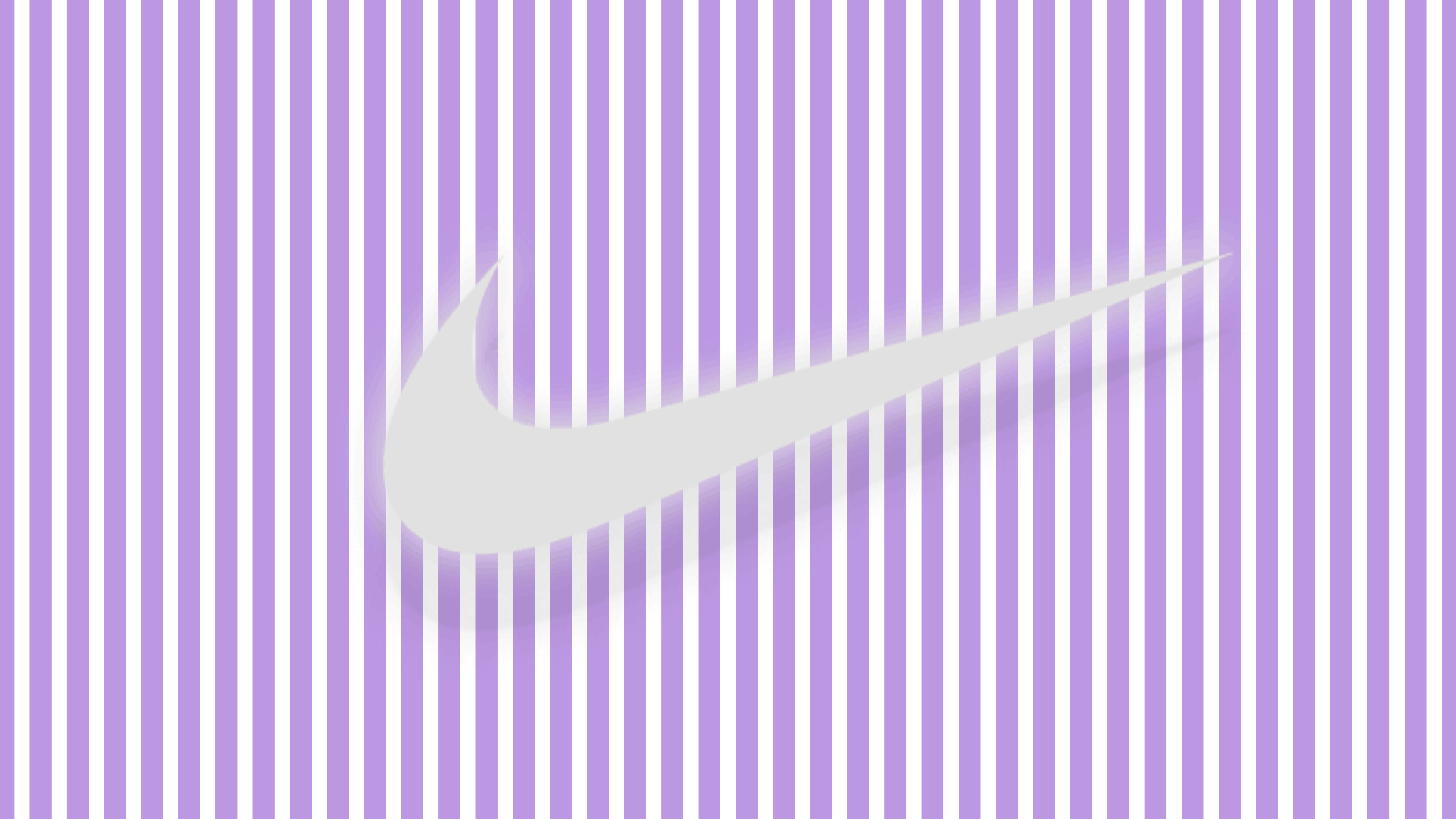

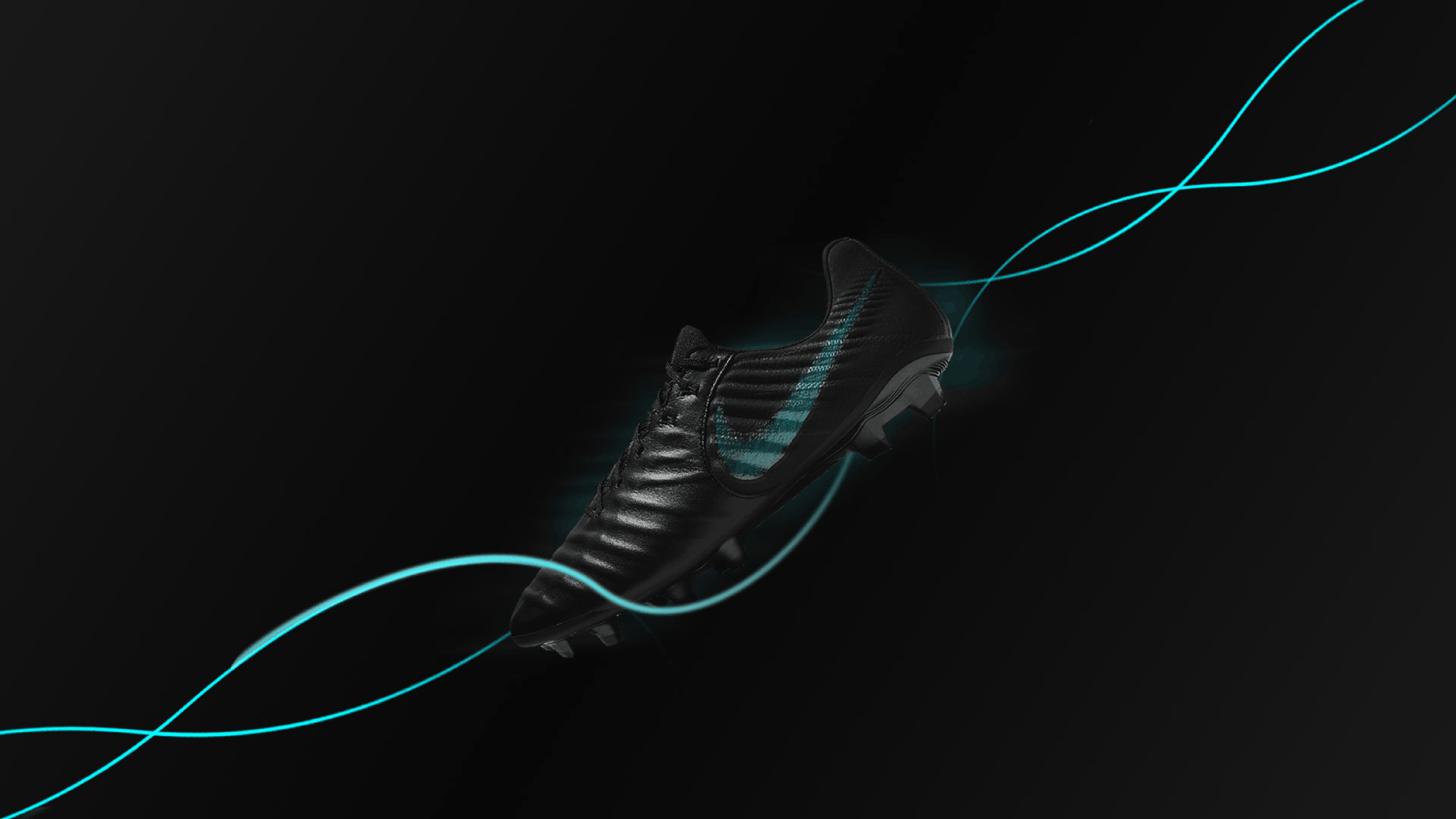

Six exploratory frames — one per emotional driver
Process
Storyboarding & concept narrowing
After the initial explorations, I narrowed to two directions that felt most aligned with Nike's tone. I storyboarded both before designing styleframes, so I could stress-test the emotion and pacing before committing to execution.
01
Direction 1 — Precision
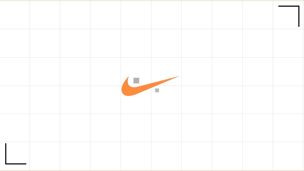
Clean contact, grid balance, breaking the frame. The concept focuses on singling out the exact moment the player's foot meets the ball - tight, controlled, graphic.

02
Direction 2 — Tension
Blue string-like lines pulling on assets in frame - a more kinetic, atmospheric take. Energy as a visible force.


After pitching both directions, the client selected Direction 1 — Precision.
Final Design
Six frames. Five seconds. One emotion.
These six styleframes were designed to build a bold, rhythmic, emotion-driven promo - hitting key beats of impact, reveal, and brand lock-up. The animation is choppy with match cuts, focusing on the precision of the players kicking the ball with their feet.
The grid and smaller graphic elements add structure and activate negative space without overwhelming the main action. Black, orange, and white do the heavy lifting.


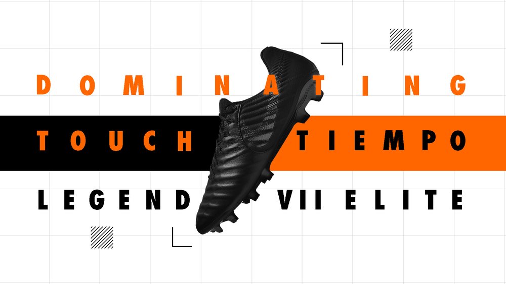
Final styleframes — "Orange Precision" direction, Tiempo Legend VII Elite
Problem Solving
Challenges along the way
Challenge 01
Open-ended brief with limited direction
how i solved it
Created my own 6-principle emotional framework to structure the visual tone - turning ambiguity into a design system.
Challenge 02
Too many early design directions
how i solved it
Storyboarded to test emotion and clarity before designing styleframes. Narrowed to two grounded concepts: Tension and Precision.
Challenge 03
Capturing Nike's energy authentically
how i solved it
Iterated with strong contrast and a "breaking the frame" concept - one that felt like Nike and also translated cleanly into animation.
Challenge 04
Balancing chaos with control
how i solved it
Refined the grid layout and added design elements that represented precision - focusing specifically on the shoe making contact with the ball.
Outcome
The "Orange Precision" direction lands
The client selected the Precision direction for further development, citing its strong brand alignment and emotional clarity. The work was later used internally to inform visual tone and pacing for a Nike campaign deck.
On the awards circuit, the project earned recognition across three major shows, including the Judge's Choice at the American Advertising Awards.
🥇 Gold ADDY
⭐ Judge's Choice
🏅 Best of Ringling Finalist
3
Major awards, including a Gold ADDY and Judge's Choice
:05s
Five seconds to capture brand emotion - impact, reveal, lock-up
6
Emotional drivers distilled into one cohesive visual language
1→1
Solo - concept through execution, no handoffs